


In Dec of 2020 MobileIron was acquired by the Utah based software company, Ivanti. I was quickly moved off my MobileIron UX team and re-positioned as Lead Visual Designer on the Ivanti Design Systems team.
The objective, with so many newly acquired products (and more continuing to be acquired), was to unify the brand experience with a modern and exciting visual design refresh, as well as deconstructing and re-defining our entire pattern library with an intuitive, consistent and visually pleasing set of UI components.
The exercise began at the concept level which was when I joined the team. It was my job to take these initial concepts and bring them to reality.
Below are images taken directly from the IDS UI Kit, as well as my explorations in developing a WCAG compliant color palette, and finally, recent before/after mockups to show our first level (bronze) implementation in the products.
As one of the foundations of IDS 2.0, I was tasked with defining a brand new color pallette. One of the challenges with this task was to meet WCAG accessibility compliance, meaning all colors meet 3:1 contrast ratio at a minimum, and all colors used for text meet 4.5:1 contrast ratio. This presented many challenges when defining states for Default (unpressed), Active (pressed), Hover, Focus (keyboard select) and Disabled.
After many hours, weeks and months I believe I have cracked the code and defined a color system that is both visually pleasing, thoughtfully executed AND WCAG compliant. Below and screenshots taken from the IDS 2.0 UI Kit and some of my explorations.
Now that I had defined a working and visually pleasing color palette, my next steps were to define how these colors would be applied to data visualizations within the product.
This work helped me to determine gaps in the primary color palette. This lead to developing a secondary color palette to be used only in charts, reserving red and green as indicators of health or status.
Most of these patterns are finalized and in the UI Kit, however I continue to refine the usage as we continue to dive deeper.
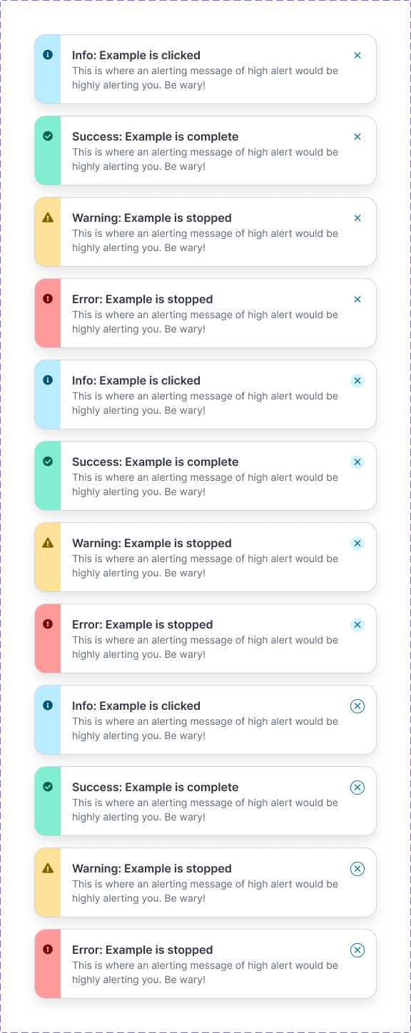
The following images are taken directly from the IDS 2.0 UI Kit, and illustrate several key UI components I either had an active part in, or am fully responsible for designing.
Note the consistency of states, color usage, and visual styling between components. Much effort has been exhausted in developing patterns that can be applied consistently across the entire component library.
The following images are some of the latest mock ups comparing the current products with how they will look once IDS 2.0 is applied.