


In 2019, MobileIron unveiled their new company logo and with it a refreshed set of guidelines and marketing materials.
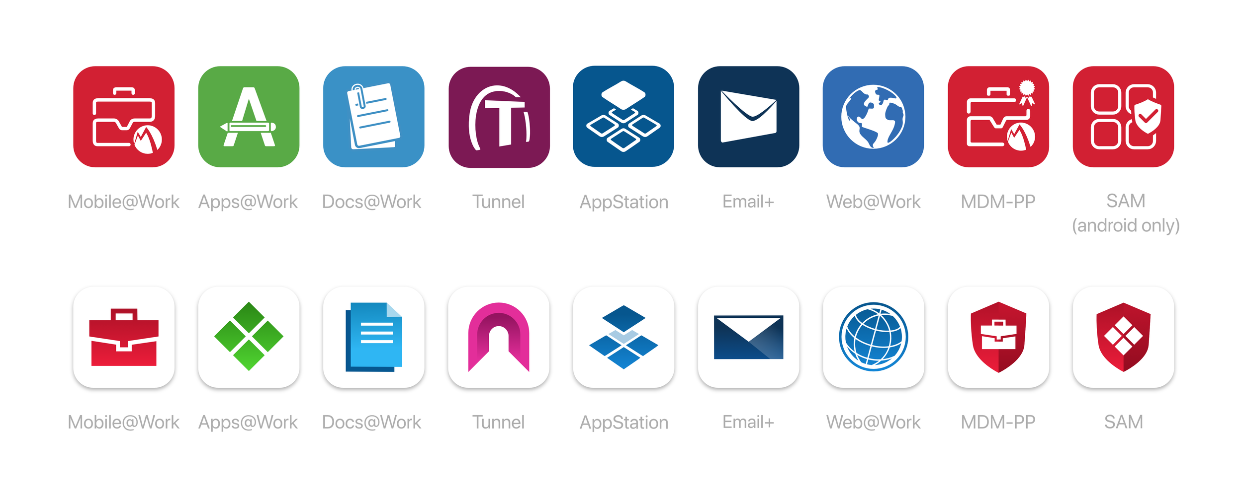
Since the current icons had been created over the last decade by multiple designers (and it showed!), I now had an opportunity to redesign the look and feel of all the product icons at once to align more with the new company vision and create a unified family of products.
For Phase 1 (as it was known internally) I wanted to create a bridge from the current icons our customers were so familiar with, while updating the style and metaphor of the actual icon to be more modern, sharp and in line with the company brand. For this reason I maintained similar colors for each app, but updated the hue to a fresher, brighter selection.
With the successful launch of the rebranded app icons in Phase 1, I now had some time to analyze the use of color in our app icons.
My goal for Phase 2 was to clearly define a set amount of colors, determine which products fit into different categories and assign one color for each category.
After meeting with each product team we decided to break up the suite into 4 categories:
Client Apps (Red)
Productivity Apps (Blue)
Support Apps (Yellow)
Distribution Apps (Green)
“Phase 2” has just been publicly announced. You should be seeing this update by the end of the 1st quarter 2020.
The very night before Citrix Receiver was to be unveiled to world at iForum (literally 5pm on a Thursday), our CEO decided that the original blue product logo should be redesigned into a black theme. I took the lead, staying the better part of the night, redesigning not only this product icon but all the necessary sizes and variations that would be needed throughout the entire Citrix Receiver application to be displayed in the morning working back and forth with the iPad developer (on an original Apple prototype iPad) and our CEO until the final pixel perfect icon was ready. It was a late night, but a great feeling to watch iforum the next morning as our CEO presented my icons and my teams designs on Citrix Receiver to the world.
For more information on the Horizon project please visit the Horizon link at the bottom of the page or in the left navigation.
In line with VMware's full product rebrand (codenamed "Unity"), I designed a full set of reimagined product icons to refresh the preexisting icons and better align with the new look and feel of the "Unity".
Ultimately though, the branding evolved in it's directions and it was decided to use a minimalist approach to the login screens that omitted the use of any product icon. Still, this was a fun exercise in developing a family of product icons that shared common stroke, width, angles and metaphors that reflected the naming and use of each product.
Many of VMware's product icons were designed by me. The abstract style and small color palette make for many design challenges. For example: Each product needs to be easily identifiable and unique, yet include these basic geometric shapes and colors. For each new icon I would discuss with the product team what meaning they would like to try and convey, and then find a way to incorporate that into the design. VRops (vRealize Operations) for example, manages the health of your datacenter. So, the "+" sign was decided as the right metaphor to include. VCHS (vCloud Hybrid Service) had to convey Cloud and Local services combining or connecting. As the product line expanded, the task of creatively distinguishing new products icons from the suite became more and more difficult.