


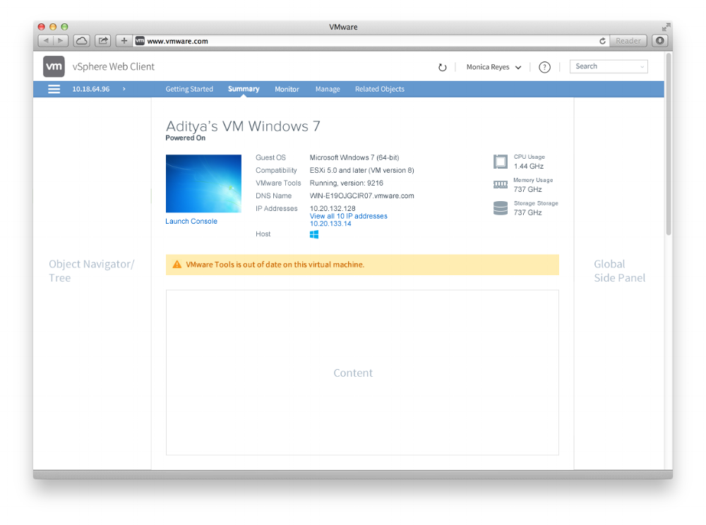


Product "Clarity" (which first started out as Unity) carried the large task of rebranding the vSphere Web Client. Precise design standards were documented to extend these design patterns to all products, and unite the product suite as a brand. Below are examples of some of the individual contributions I designed, including the detailed specifications that would assist the development team in the creation of vSphere and future products.
Below I had the opportunity to step in and rework the structure and components to the "work in progress" vRops redesign. The content was in place, but it needed a visual design second pass.
This was the existing summary screen in the original "marge" theme branding. As you can see there is a LOT of information to take in. Using what Unity standards had been approved I set to redesign this screen, creating new designs for the icons, status bars and portlets, as well as exploring a new color palette.
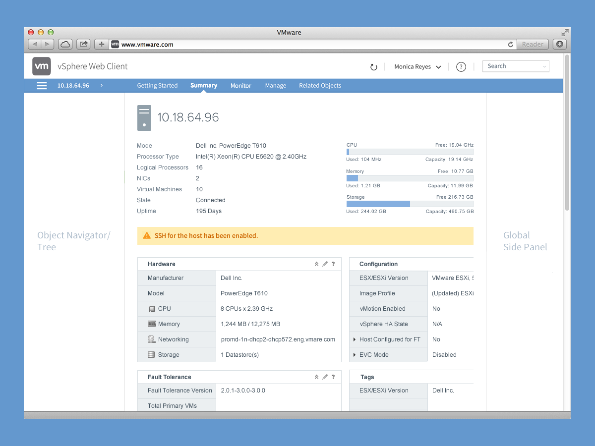
Following the approved branding of the log in screen and with some Unity standards already in place, I was responsible for visually updating the summary screen and all its components including new icons, a new portlet design, refreshed progress indicators and experimenting color usage within the Unity palette.
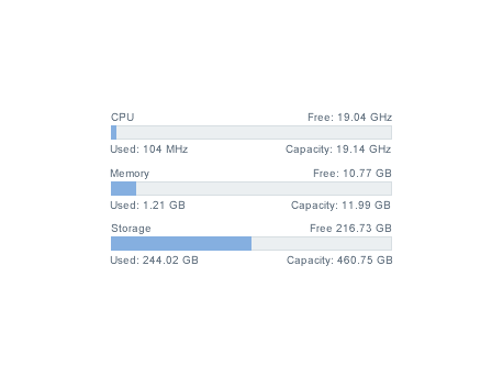
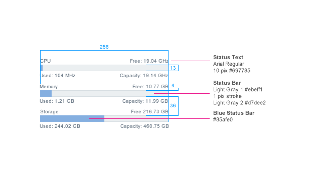
Applying the patterns established in the above Summary Screen, I converted the fonts, incorporated the correct alert status bar, and created a new set of simple and clean single color icons.
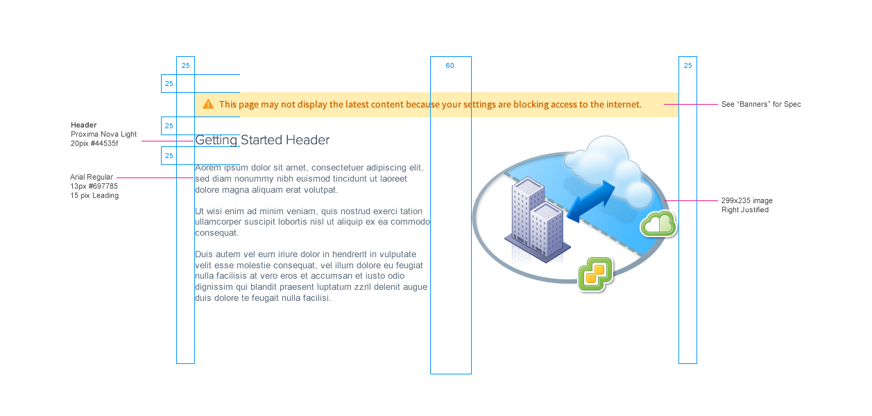
Continuing with the Unity patterns that I and my team had now established I created this simple Getting Started layout as well as created the illustration.
After a team review, I reconfigured the top navigation again and the structure of the alert bar to own it's own space, separate from the header and tabs.
I also felt the old style vCops icon did not fit well in the TOC and went for an all white design which I felt matched much better to the UI and the Clarity brand altogether.
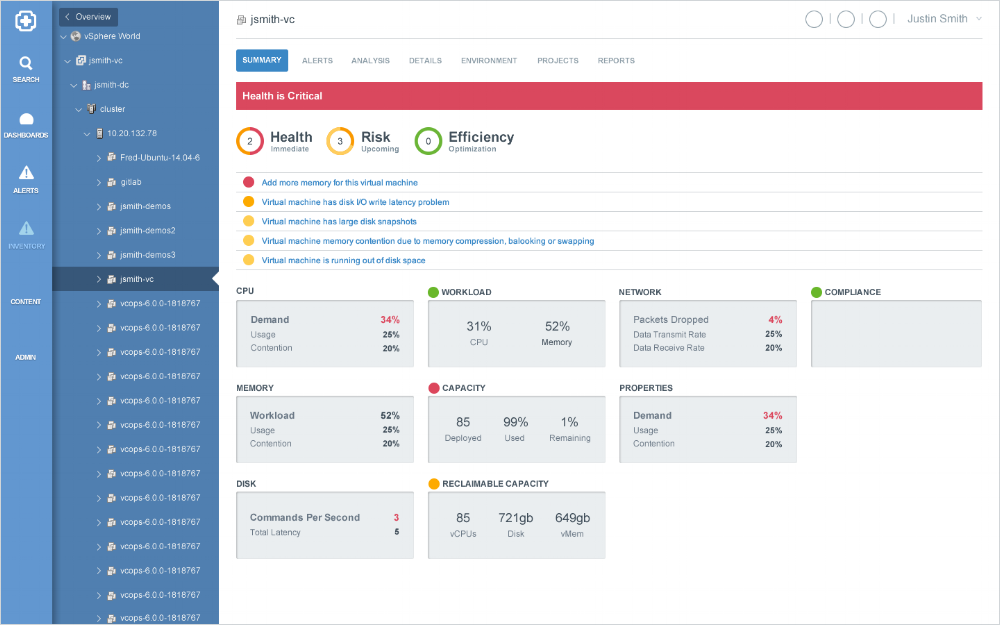
This was the final mock up I delivered. This project was moving fast with many designers working on separate projects at once, so we were constantly having to update specific components as they were approved. I was part of a great team where our collaboration made it truly a unified project.
Here is one of my early iterations. After establishing the grid from the below v1 mock up I began the total designing, refining the spacing in the TOC (with some redesigned placeholder icons) as well as implementing colors from the Clarity palette.
This was also an exploration of how to display the main alert at the top of the screen. Here I combined the alert with user settings. The idea was to allow for more real estate below for additional content. I later abandoned this idea for some obvious reasons.
As my first step I set only to rework the layout, grid and positioning of the existing design. It's rough and dirty, but the first step towards a high fidelity redesign.
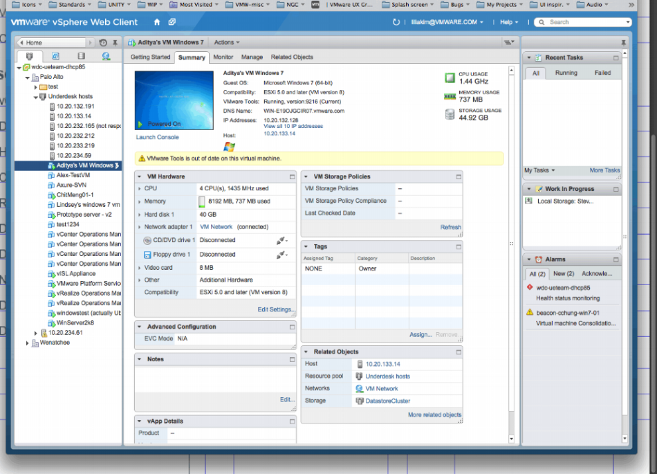
This image was the "before" design I was handed to redesign and brand in the current Clarity standards.
At this point some Clarity standards had already been established (the notification bar, fonts, alerts), however, the color palette, cards, TOC and overall layout were unexplored and needed an overhaul.
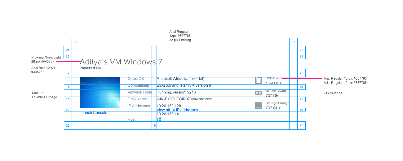
With the designs approved, detailed and precise specifications were created with call outs to assist the development teams in implementing these new patterns.